Hellooo? Anybody out there?
Sometimes, posting on social media can feel like shouting into a void—especially on a high-volume, short-form medium like Twitter.
You pour time and resources into building an audience, curating and crafting interesting content, and hope your message doesn’t get lost in the mix. You might run paid campaigns to target a specific type of follower with a specific type of message in the hopes that they’ll give you a click.
But with increasing competition for your followers’ finite attention span, getting people to tap on your link is an achievement in and of itself. If the page doesn’t load quickly and show them exactly what they want to see, they’ll bounce.
Put simply, you work hard for engagement—don’t squander those clicks by sending them to a generic web page.Instead, use Twitter landing pages to help you get more value from every follower who clicks.
What is a Twitter Landing Page?
A Twitter landing page is a unique web page created specifically for traffic from a Twitter campaign.
Whether you’re targeting paid or organic traffic, a Twitter landing page is always a better alternative to sending those visitors to your website or a generic product page. In fact, a dedicated landing page is the perfect place to send any clicks you get from social media.
Why? Let’s try this metaphor on for size:
Sending social media traffic to a generic page is like throwing a giant party that tries to appeal to everyone. There’s a lot of noise, the food is bland, and the space is crowded because you invited over so many people.
Sending traffic to a dedicated landing page, on the other hand, is like hosting a more curated, intimate event for one particular group of friends. You know exactly who’s attending and have set up a cocktail station with their favorite drinks, created a playlist with their favorite music, and prepared some of their favorite snacks. In other words, as soon as your guests—or landing page visitors—arrive, they’ll find exactly what they’re looking for.
Not sure which social media channels your brand should be advertising on? We’ve gotcha covered! Check out this article on choosing the best ad platform for your business.
Today, we’ll cover how Twitter landing pages work within a larger social media marketing strategy, talk best practices for creating your own high-converting landing page, and look at some real Twitter landing page examples created with Unbounce.
How Twitter Landing Pages Fit into Your Social Media Campaigns
As with any landing page, Twitter landing pages work best as part of a specific campaign. Whether you’re running a paid or organic Twitter campaign, sending followers to a dedicated landing page allows you to cater directly to your target audience, maintain momentum, and turn those clicks into conversions.
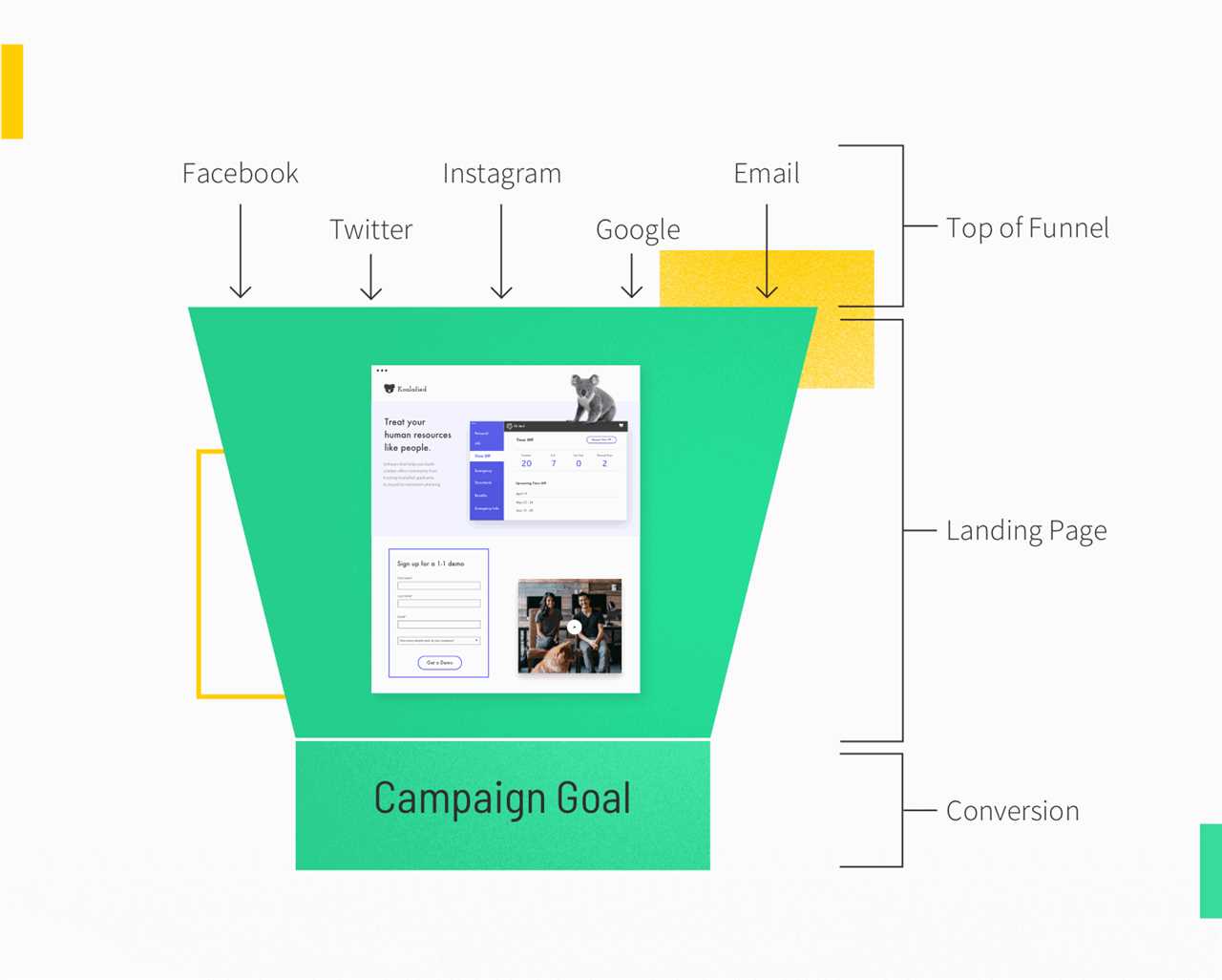
A landing page results in more conversions than a homepage because it offers personalized messaging designed to drive action. Plus, there are fewer distractions (like a nav menu with competing links), which means visitors’ attention is 100% focused on your offer.
By sending your audience to campaign-customized Twitter landing pages, you can make a stronger, better impression that leads to more conversions and boost your ROI.
Note: When you pay for a Promoted Tweet, you can choose exactly who gets to see it. So, rather than tweeting out to your entire list of followers, you can nudge a few specific people who are most likely to respond to your message with action.
Best Practices for Creating Your Own Twitter Landing Page
Before we dig into the examples, let’s look at what the best Twitter landing pages have in common. Here are some best practices to consider when designing your own landing page.
Cater to a specific audience. It’s important to focus on one customer type at a specific stage in the sales funnel. If you want to target multiple customer types with unique offers, create a Twitter landing page for each segment and target your ads accordingly.Match campaign messaging to the on-page offer. Twitter landing page visitors are special because they’ve already shown you what they’re interested in by clicking on a specific Twitter link. You’ve already convinced them to step away from the endless stream of stimuli that is social media and it’s up to your landing page to keep them engaged. And since you can match Twitter landing pages to your specific tweet, it’s always in line with audience expectations.Make sure your landing page looks and works great on mobile. If you’re not catering your web presence for mobile, you’re missing out on a huge chunk of potential traffic. This is especially true when your audience is coming straight from social media, where the majority of scrollers are on their phone.Include a single, clear call-to-action (CTA). Every good landing page (including the Twitter landing page examples we’re about to dig into) must include a powerful call-to-action. After all, in order to convince visitors to do something specific, you need to ask them directly—and make it ridiculously easy for them to take action. A clickable CTA button is the easiest way to show and tell visitors what you want them to do next.Writing impactful copy takes more than a desire to do so. That’s why we developed the Unbounce Guide to Landing Page Copywriting to walk you through the process.
7 Twitter Landing Page Examples Built with Unbounce
Now that we know what makes a good Twitter landing page, let’s look at some actual examples that incorporate these elements. We focused on examples that receive most of their traffic from Twitter and, even better, are part of a very specific Twitter campaign.
1. FireHydrant
FireHydrant is an incident and systems management platform that helps teams of all sizes prepare for, prevent, and put out technical “fires.” They offer solutions for the full incident response lifecycle, from alerting your team to communicating updates.
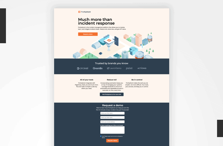
Image courtesy of FireHydrant. Click to see a larger version.
Why this Twitter landing page example works:
With 91% of its traffic coming from Twitter clicks, this landing page example hits all the major notes needed to connect with FireHydrant’s audience—including message match, social proof, and a clear call-to-action.
“For this specific campaign, we were testing how ‘free trial’ would fare against ‘requesting a demo,’” explains Joanna Lin, Head of Marketing, FireHydrant. “And the best way of supporting the messaging in our ad campaign was to have tailored landing pages for each—that way we aren’t sending them to our marketing site which isn’t built for dynamic messaging and thus may not drive the conversion we were looking for.”
Here’s a look at the tweet driving traffic to this landing page example:
Call us rebels? We couldn't find an incident management tool that worked for us, so we built one. Try it today. Reduce toil, stress less, and get more done.— FireHydrant (@FireHydrantIO) September 15, 2020By using similar language in the tweet (“How to turn 10 minutes into just 10 seconds”) and on the landing page (“Want to learn how FireHydrant can help you turn the first 10 minutes of your incident into just 10 seconds?”), FireHydrant nails message match and reinforces the value prop that brought visitors to their landing page in the first place.
We also love that the landing page quickly relays key information (“Much more than incident response”) and builds social proof (“Trusted by brands you know”) all above the fold.
2. Teaching Personnel
Our next example comes from Teaching Personnel, a UK-based recruitment agency for teachers and learning support staff. They serve over 5,000 schools per year with access to over 14,000 educators and classroom support staff.
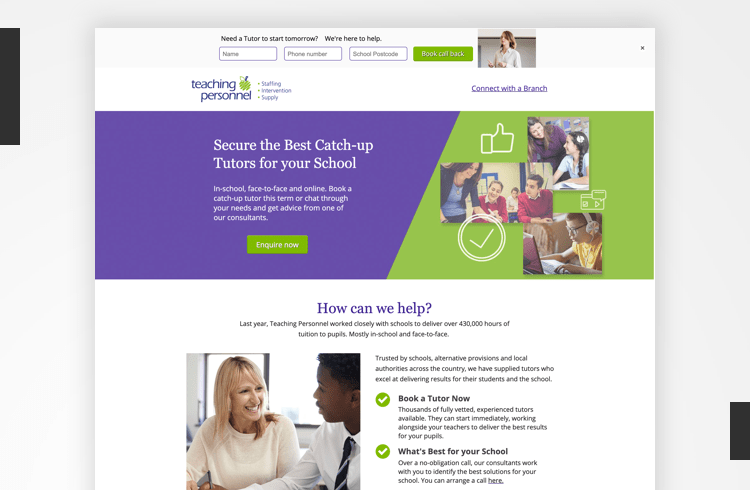
Image courtesy of Teaching Personnel. Click to see the full page.
What we like about this Twitter landing page example:
On this A+ landing page example—which owes 94% of all traffic to a Twitter campaign—Teaching Personnel is promoting a COVID-friendly tutoring service focused on helping students make up for lost classroom time.
Regardless of whether Teaching Personnel offers “catch-up tutoring” as a standard service, this page frames it as a solution to the most pressing problem visitors are facing right nowThe page highlights the value of catch-up tutors for in-school, in-person, and online sessions, with an added emphasis on their COVID safety protocols.
Not only is the copy specific and value-focused, but it also addresses potential objections pre-emptively. By anticipating the most common objection their audience might have (the cost), Teaching Personnel is able to address it without sending traffic away from their website. Instead, the landing page links to an article on their website about how to access catch-up funding provided by the UK government.
Teaching Personnel also gets bonus points for consistency. They repeat the same call to action throughout the page (“Enquire now”) and clicking on any of the CTA buttons instantly scrolls readers to the contact form. This is a simple-yet-effective way to encourage visitors to take action the moment they show interest.
3. VMware Tanzu
VMware Tanzu helps developers, IT professionals, and business leaders manage app production. Their solutions make building products more efficient, in part by allowing developers to focus on coding and simplifying ops.
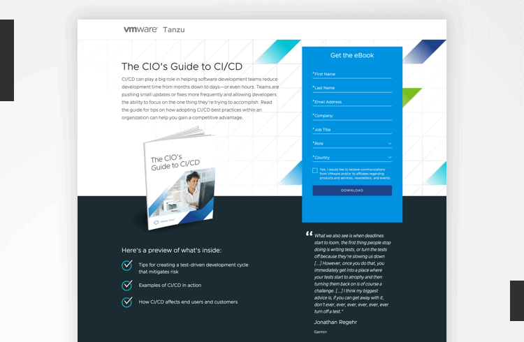
Image courtesy of VMware Tanzu. Click to see the full page.
Why this Twitter landing page example works:
With 90% of all traffic coming from Twitter, this landing page serves one clear goal: getting visitors to download the guide. The larger campaign purpose, of course, is to capture qualified leads by offering relevant content in exchange for visitors’ contact details.
One of the best ways to persuade visitors to fill out a lead gen form, like the one in this example, is to set clear expectations and preview the value of your offer. Check out all the ways VMware Tanzu manages visitor expectations and build interest on this landing page:
Providing a sneak peek at the content. The “preview of what’s inside” tells readers what to expect from the ebook, while also enabling visitors to confirm that they’re actually interested.Introducing us to the speaker. The friendly headshot and detailed bio tell us who will be presenting, which again sets expectations, but also builds credibility.Paired with the right lead magnet (whether that’s a white paper, webinar, or other high-value offer), you can use this type of Twitter landing page to build your email list and nurture leads who aren’t quite ready to buy or subscribe.
4. Maëlle Gavet (Agency: Target Marketing)
Maëlle Gavet is a business leader, “techpreneur,” and author of Trampled by Unicorns: Big Tech’s Empathy Problem and How to Fix It. This page, designed by the agency Target Marketing, promotes her free guidebook on fostering human-centric workplaces to followers on Twitter.

Image courtesy of Maëlle Gavet. Click to see the full page.
Why this Twitter landing page example works:
We love this simple, clean landing page. Everything from the CTA (“Download my guidebook”) and lack of distractions above the fold to the easy-to-skim bullet points and two-field download form make this page easy to engage with.
This is one of the shortest pages we’re looking at today, but it’s not lacking in content. The description highlights main topics, framed in terms of value offered to the reader (“You’ll learn how to…”), followed by a large author photo and biography that fills the bottom half of the page.
Though most of the page’s visitors (~85%) come from Twitter, the page smartly includes an overview of Maëlle’s achievements to solidify her value as a thought leader with real-world experience. This is especially important if Promoted Tweets were used to drive traffic, as some of the targeted audience might not be familiar with Maëlle Gavet or her work.
From a design perspective, showcasing the book on a tablet gives the reader a visual cue to help them understand the value of what they’re downloading. As with any kind of digital download (like the webinar we looked at above), incorporating a screenshot, slide, or title card from the content itself is an easy way to visually represent the offer on the landing page.
5. IronCore Labs
The encryption and security specialists, IronCore Labs help SaaS businesses implement “privacy-by-design” into apps and anywhere sensitive data is stored.
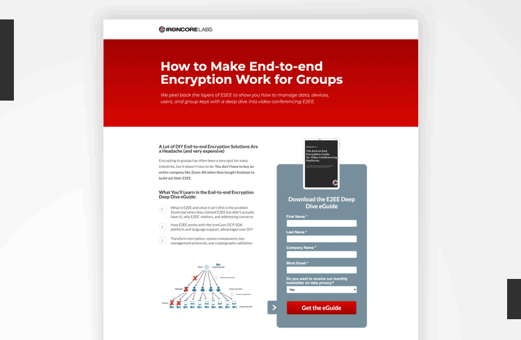
Image courtesy of IronCore Labs. Click to see the full page.
Why this Twitter landing page works:
Let’s focus on the headline here: “How to Make End-to-End Encryption Work for Groups.” This immediately tells us what the page is about and addresses a relevant problem for the target audience. Even better, the headline is a word-for-word match with the copy used in the tweets used to promote it (which, by the way, powered 90% of all traffic to this page).
Peel back the layers of end-to-end encryption and learn how to manage data, devices, users, and group keys with our latest deep dive into E2EE. Download the eGuide below! #dataprivacy #e2ee #encryption— IronCore Labs (@IronCoreLabs) October 7, 2020“I think this landing page works for two main reasons: it’s good content for the right audience and the value proposition is clear,” says Riah Solomon, Demand Generation Manager, IronCore Labs.
“Unbounce’s landing page templates definitely help steer our pages in the right direction by encouraging visuals and bullet points. I also love how easy it is to make these mobile-friendly. That’s really important when running social ads.”
Here’s what else IronCore got right:
Speaking their audience’s language with the use of in-group acronyms (like “E2EE”).Agitating a common pain point for their audience: “A lot of DIY End-to-end Encryption Solutions Are a Headache (and very expensive)”.Using the rule of threes to lay out the top three benefits of downloading the guide.Clever use of visuals. In addition to an image of the cover, this page also includes a handy diagram to help readers visualize a difficult concept—which also previews how visuals are used within the download.6. #Paid
#Paid is an influencer marketing platform that helps brands match with content creators. They set themselves apart from similar agencies by focusing on content creators vs. traditional influencers.
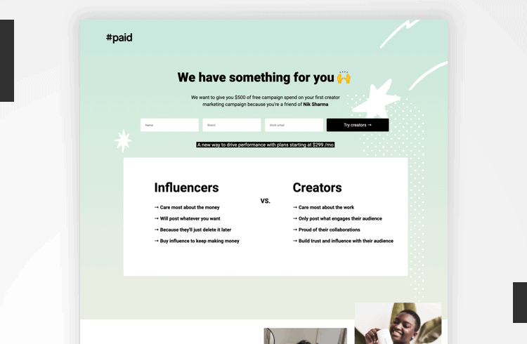
Image courtesy of #Paid. Click to see the full page.
Why this Twitter landing page works:
There’s a lot to unpack here, but let’s start with the obvious: It’s pretty. With a soft color palette, whimsical design, use of emojis, and high-quality photos, this landing page looks an awful lot like a finely curated social media profile.
There are clusters of images for each example to showcase real campaigns executed by #Paid’s team of creators. Plus, it’s an offer for $500. That type of giveaway tends to do well on social. A special offer or contest can help cut through the noise.
But perhaps the best part is how the page is personalized to support the rest of the campaign. The reader only has access to this offer because they clicked on a referral link—and that’s reflected in the copy (“We want to give you $500 of free campaign spend […] because you’re a friend of Nik Sharma”).
Here’s a look at the tweet (from eCommerce leader Nik Sharma) driving traffic to this page:
I say it often, but influencer marketing isn’t dead… It hasn’t even started. Connect with my people over at @hashtagpaid. They’ll set you up with $500 of free spend on your first campaign. Just tell them I sent you.
— Nik Sharma (@mrsharma) October 25, 2020
“We promoted the tweet to [Nik’s] audience and our lookalikes. The tweet had a number of variations that we tested,” says Chukky Ndu, Growth Marketing Manager at #Paid.
“The landing page worked well because the offer and the form were at the top of the fold. We were able to share the #paid platform to our target audience as well as Nik’s audience. We also tested the Smart Traffic feature and got additional conversions.“
7. Coralogix
Our final Twitter landing page example comes from Coralogix, a data and log management tool. They work with SaaS and tech companies to unearth relevant insights more quickly and efficiently.
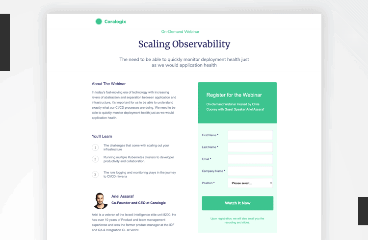
Image courtesy of Coralogix. Click to see the full page.
Why this Twitter landing page works:
One of the best things about this landing page? The fact that there’s only one path forward (registering for the webinar). While this is generally advised as a best practice for landing page design, it’s not often followed prescriptively.
Even landing pages centered around a single CTA often include at least one external link (typically to the brand’s home page). In fact, most (if not all) of the landing pages we looked at today include multiple points of exit.
However, since this page gets 95% of its traffic straight from Twitter, it’s safe to assume that visitors are more interested in the webinar itself than what Coralogix does (at least, at the moment)—so the choice not to link to the home page makes sense.
It’s also worth noting the simple, clean design and short page length. This page includes just enough copy to be persuasive and highlight expertise without overwhelming or distracting the reader. It’s a simple white page with black text, but the webinar registration form is appropriately highlighted in Coralogix green.
Use Twitter Landing Pages to Make the Most of Your Social Traffic
Now that you’ve been inspired by our Twitter landing page examples, it’s your turn to get in on the action. Whether you’re looking to generate more leads, book more demos, or entice followers with an exclusive offer, a dedicated landing page can help you get the results you’re after.
Ready to get more value from your Twitter traffic with a conversion-focused landing page? See for yourself how Unbounce helps brands harness the power of social media with landing pages that turn engagement into conversions.

By: Emily Bauer
Title: How To Create a Twitter Landing Page (With 7 Examples)
Sourced From: Original article available: unbounce.com/social-media/twitter-landing-pages/
Published Date: 2021 02 17


