First impressions make all the difference – especially when you’re trying to generate leads for your business.
If a potential customer wants to get your lead magnet or sign up for your service (or product), there’s a good chance the first page they’ll see is your landing page. And if you want your business to thrive, your landing page needs to be effective.
If it works well, it can get more subscriptions, grab more email addresses, and even boost sales. But a poor landing page can leave a bad taste in your potential customer’s mouth and cost you a lot of your marketing budget. Without leads, your business won’t have customers. And well… we all know what happens to a business without customers ?
This is why you need to master what a winning landing page looks like. Now let’s take a look at seven lead generation landing page examples that work well so you can draw inspiration from them. We’ll then also share landing page optimization tips that’ll help you drive even more leads from your campaigns.
Did you know? You can get your lead gen campaign off the ground in minutes using the GetResponse Landing Page Creator. It comes with tons of free mobile-optimized templates & syncs seamlessly with all of our lead generation solutions.
Table Of Contents
1. KlientBoost
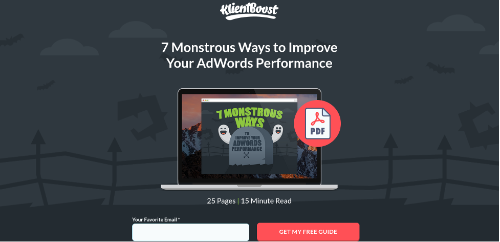
KlientBoost lead capture page asking for minimum personal information.The first lead generation landing page on our list is this simple, aesthetically pleasing page from KlientBoost.
Right off the bat, there are several parts of this landing page that *pop.* Not only have they created a custom graphic for their lead magnet, but they’ve also created a theme around the free guide that makes it fun and interesting.
It’s also straightforward. There’s not a lot of copy, and the strong headline tells anyone who lands on the page the benefit they’ll be getting — a free, 25-page guide on improving their AdWords performance.
Another part of this landing page that makes it stand out that isn’t obvious from our screenshot is its loading speed. Potential customers won’t wait around for slow loading pages, so KlientBoost’s 
Simple form and CTA from KlientBoost.
Instead of asking a potential lead for a bunch of information, KlientBoost is asking for a single item: an email address. Not only does this minimize friction during the lead generation process, but it also emphasizes (once again) that the guide is free.
Lessons to steal from this example:
Don’t ask for more than you need to on your sign-up form.Make your benefit clear immediately.If you’re giving away information for free, use that as a selling point!2. Integrify
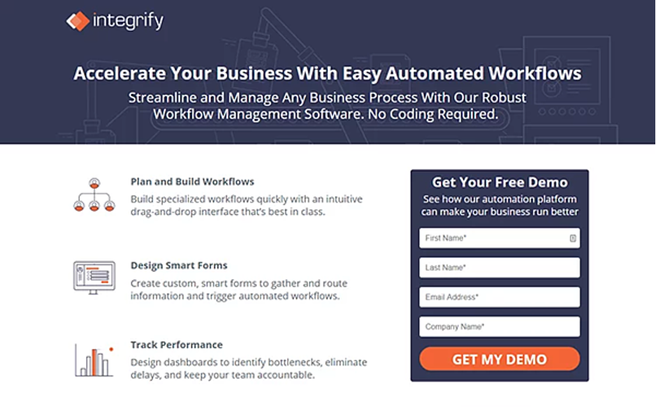
Detailed landing page from Integrify.
Integrify’s software is geared towards businesses that want to build automated, customized workflows.
On their landing page, they offer a free demo as a form of lead magnet. This explains why they’re asking for more details (First name, last name, company name) than just an email address.
However, this is strategic. When a lead is demoing the product, the sales and marketing team will have access to their name and the company they work for so they can personalize further communication.
The copy is also super smart. Integrify is assuring them that they don’t need to know how to code to create their own custom, smart forms.
By telling a lead that the product will “identify bottlenecks and eliminate delays,” they’re highlighting the value of their product. However, if we scroll down the landing page a little further, we reach the best part:
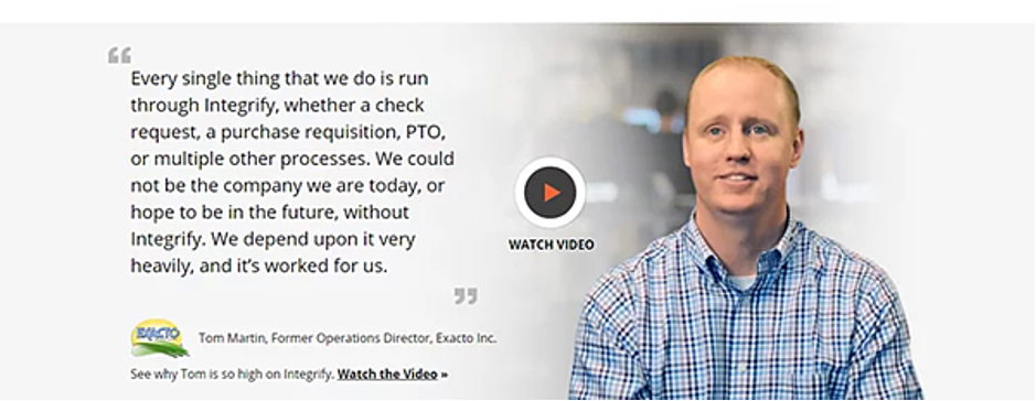
Video testimonial from Integrify’s customer.
What Integrify has done here is smart — they’ve combined social proof and a video of how the tool works into one section of the landing page. If a lead is interested in the product, but they’re not entirely sure how it works, all they need to do is scroll below the fold of the landing page.
There, they’ll see a video of a current customer explaining exactly how the tool has added value to their business.
This combination is something you could steal for your own landing pages. Not only does it paint your product in a positive light, but it also puts a human face to a happy customer ?
Lessons to steal from this example:
Use concise copy to magnify 2-3 main benefits of your product/service.Videos can act as social proof and add a human element to it that makes your product/service more engaging to potential leads.Find out how Alex Terrier, jazz musician and music teacher, achieved a 19% email signup rate from his landing pages using GetResponse.
3. FireEye
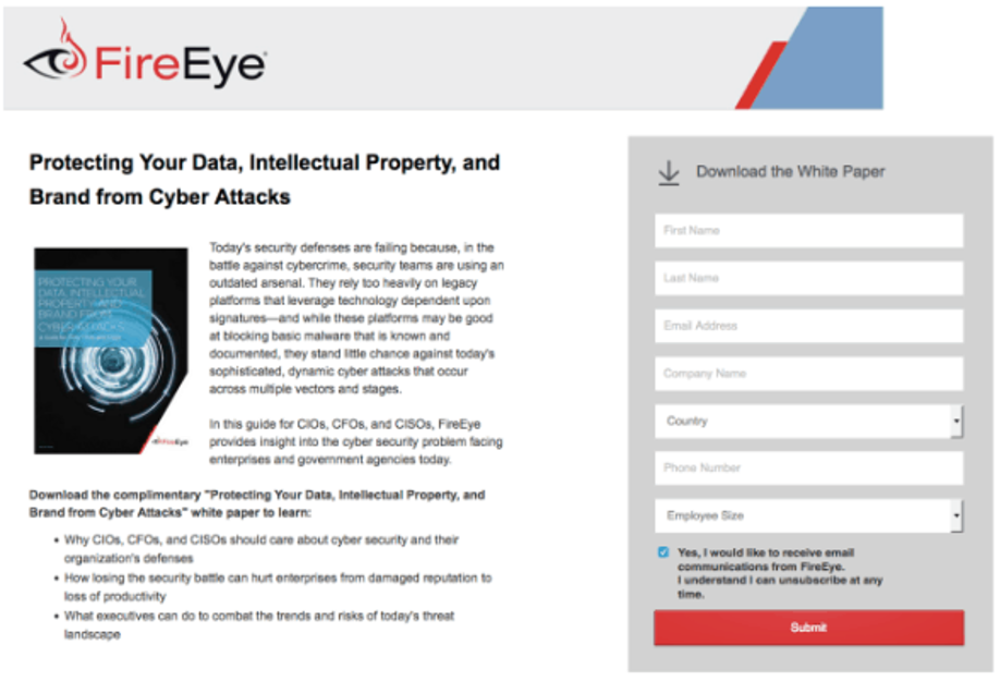
FireEye landing page.
This landing page from FireEye tells a story — while brands are at risk from cyber attacks, there are ways you can protect yourself.
If you’re selling a serious product like security, your design and message must reflect it. That’s why FireEye’s white paper’s landing page works.
Here’s what you can steal from this landing page: minimalism.
The topic of cybersecurity is really complicated, far too much to explain in a couple of paragraphs on a landing page. However, FireEye has taken three important parts of its white paper and turned them into bite-sized bullet points.
That way, a lead can be sure the white paper will answer some of the most pressing questions they have about cybersecurity.
The download form also asks for the lead’s name, company details, and employee size. So it’s easy for FireEye to personalize communications once they’ve downloaded the white paper.
Lessons to steal from this example:
If you’re selling a serious product, make sure your copy and tone reflect that.If your product/service is complex, break its main features down into bite-size bullet points so it’s easier for people to digest.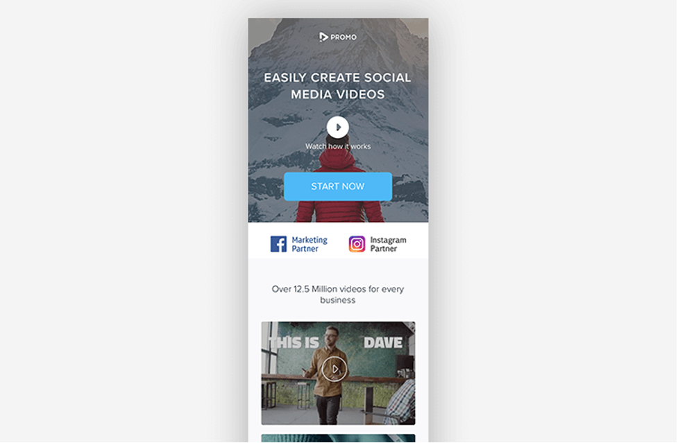
Promo landing page featuring beautiful videos.
Your landing pages need to be mobile friendly — just like Promo’s. The tool is helping businesses create beautiful videos easily, so it’s no surprise their landing page promotes beautiful videos.
But if we dig a little deeper, there are small touches that make this landing page stand out. The videos are set to autoplay, so a potential lead instantly sees what they can create for their own business as soon as they land on the page.
The subtle additions of the Instagram and Facebook logos also highlight Promo’s unique selling proposition — the product is perfect for creating videos for social media platforms. And finally, the clear call-to-action that stands out because it’s the only part of the page in a light blue color.
The lesson here? Make it immediately clear to your customers what your unique selling proposition (USP) is and if you can—highlight it by using your own products.
Lessons to steal from this example:
Using your USP on your landing page is an easy way to amplify your product’s value and show potential customers how it works.Always…. Always… check that your landing page works on mobile devices.5. Open Mile
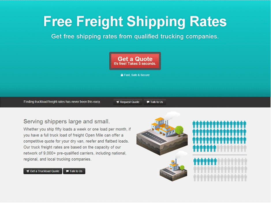
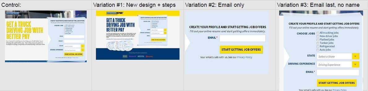
Open Mile landing page with a bold CTA button.
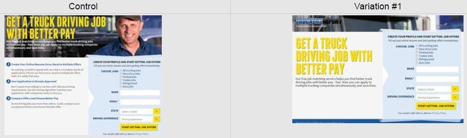
Open Mile is a great example of how to fix a landing page that… wasn’t working so well.
While the landing page above now brings in a ton of leads for the freight company, it wasn’t always this way. Here’s what the landing page used to look like:
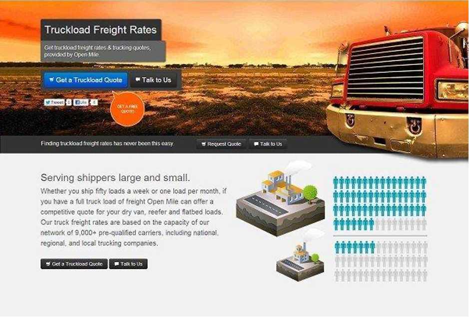
Open Mile complex landing page with no emphasis on CTA.
A lot is going on here. There are lots of different colors and it’s not clear what Open Mile wants the customer to do. Do they want a customer to talk to them? Get a quote? Request a quote? It’s too much.
By changing up the masthead and adding a bold, clear call-to-action, Open Mile increased their lead generation by 232%.
The lessons here are easy to steal:
Avoid using distracting images and colors. Use bold call-to-actions and make it clear what you want your lead to do.Make your value proposition clear.It’s a masterclass in how some simple changes to a landing page can supercharge your lead generation.
6. Julia Morgan Ballroom
![7 Lead Generation Landing Page Examples [+ Optimization Tips]](https://internetmarketingworldwide.com/images/blog/thumbnails/202101/img_18011202178.jpg)
For small business owners and those in hospitality, sometimes getting across your value proposition in a landing page is difficult.
San Francisco’s Julia Morgan Ballroom overcomes this in their landing page using a simple, classy design that highlights why customers should pick their venue.
By telling a potential customer what they’re best at — exclusive weddings — and immediately highlighting that their staff will take care of all the details, it’s clear who their target customer is: overwhelmed soon-to-be newlyweds.
If a lead fits into this category, their eyes will then hit the juxtaposed “reserve now” call-to-action, that asks simple details like guest numbers and wedding date.
However, if a lead needs more convincing, they can scroll down and hit the best part of the landing page: its social proof. The venue highlights its past guests, from former US presidents to foreign dignitaries, to prove that its venue is what it claims to be — coveted.
There’s one simple lesson to steal from this example:
Know who your target audience is and don’t be shy about crafting copy that speaks directly to them.7. GetResponse
Sure GetResponse offers lead gen tools and this makes me a bit biased. But hear me out.
First and foremost – I’m a marketer. My team’s job is to educate our audience and to generate leads, too. That’s why we’ve got a fair amount of lead generation experience and data to back it up.
Here’s an example of one of our lead generation landing pages that we put together for our previous holiday marketing campaign.
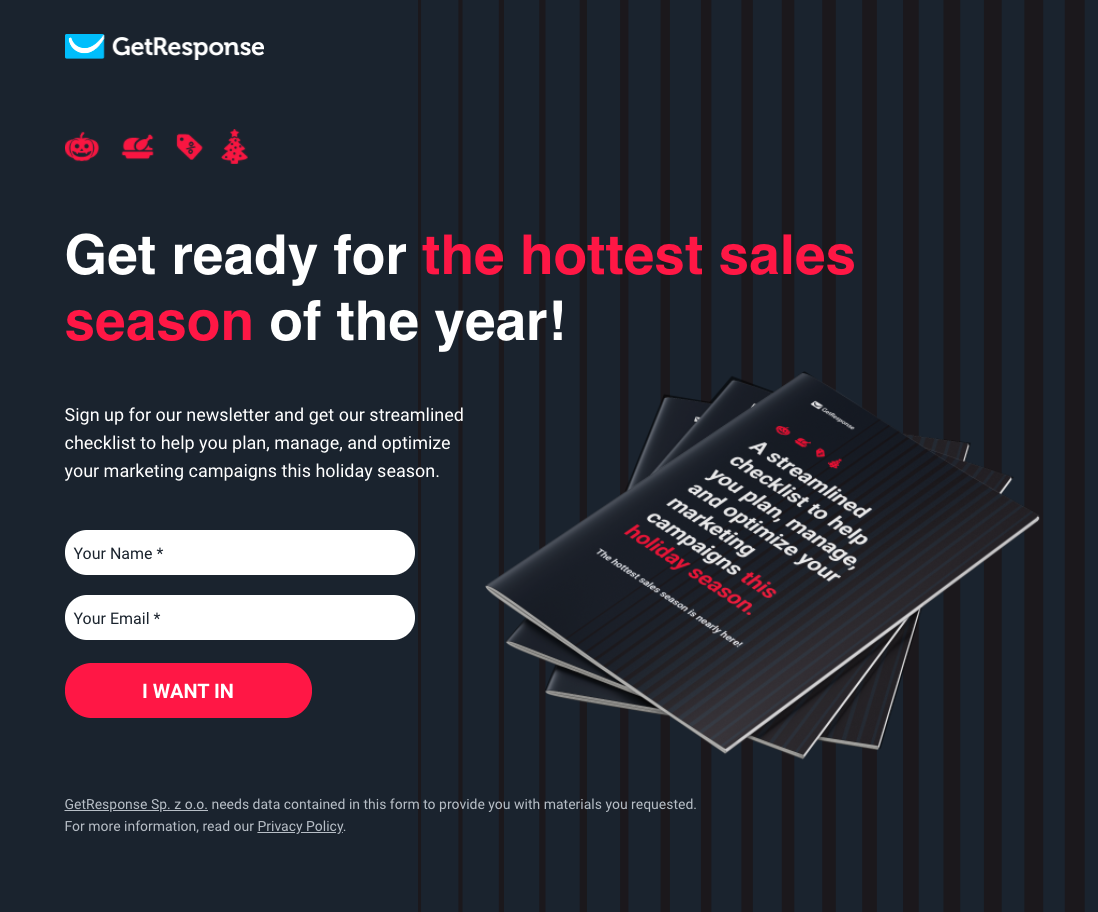
Lead gen landing page example from GetResponse.
This landing page generated almost 1,000 leads scoring a conversion rate of over 24%.
And we even got the conversion rates to reach almost 60% with the same landing page template when we localized it to other markets (German, Polish, Spanish).
So why did it work?
It’s super simple. The headline and the single paragraph do all the talking. You can scan it and in less than 5 seconds you know whether the offer’s right for you. And there’s no need to scroll up or down – everything fits on one screen!
Also, the cover image makes the checklist look more like a physical product. These tend to feel like something of more value than a simple PDF file. Which in our case made a lot of sense, because we designed the ebook to be useful when printed out.
Last but not least, what made this lead gen asset so powerful was the traffic that we attracted to it. It wasn’t some cold traffic that came from a solo ad. These were the folks that clicked on the GetResponse ad (email or PPC), entered our main holiday landing page, and only from there – decided to click-through to access the ebook.
Here’s what you can steal from this examples:
Be as concise as possible when complexity isn’t neededMake your offer tangible and valuable (e.g. by making the ebook look like an actual book)Pick your audience carefullyHow to increase your landing page conversion rates
1. Make your landing page easy to peruse
There’s a reason the seven landing pages we featured boosted lead generation. They were simple and told potential customers exactly what they wanted from them.
The golden rule of landing pages is that the offer should be obvious. If a potential customer hits your landing page and it isn’t obvious within a couple of seconds what you’re offering or what you want them to do, they’ll bounce.
So focus on making your page as easy as possible for leads to navigate, fill out a form, or request for your quote. If you add too many forms or the page is too cluttered, it can impact your conversion rate.
Here’s a perfect example:
When CXL’s Peep Laja had to improve the conversion rate on a client’s landing page, he set out to create a simpler, shorter version of the page. Here’s the before and after:
Laja said his first step was to condense the copy on the page and make its layout shorter. It boosted lead opt-ins by 21.5%, but he knew he could make the results even better—so he kept simplifying. He also:
Removed any unnecessary form fieldsRemoved large images and made the offer bolderAdded drop-down boxes to the sign-up form to make it easier for the customer to fill out detailsHere’s what the variations looked like:
The last variation, which used drop-down boxes and a simple call to action, boosted opt-in levels by 44.7%.
This case study is proof that making your landing pages easier to navigate helps your conversion rate.
2. Use testimonials and case studies to improve conversion rates
We’ve already highlighted how important testimonials and social proof are in our examples, but case studies can also have a powerful effect on your conversion rates.
Case studies often carry more weight than testimonials. They break down what problems a customer had and how a product or service helped them to overcome it.
Plus, they give potential customers a way to analyze how your product or service worked without having to reach out for a demo or further information.
A business that has mastered using case studies on its landing pages is Drift. Here’s what a landing page for one of its tools — conversational marketing — looks like:
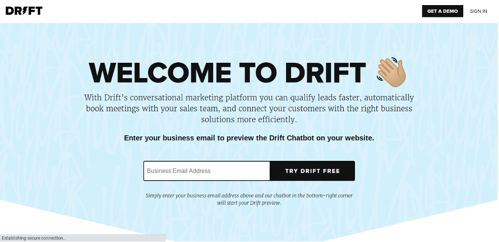
Drift simple landing page with the form in the above the fold section.
If we scroll down a little further, the landing page runs through what the tool does and how it can help businesses. But then, we get to this:
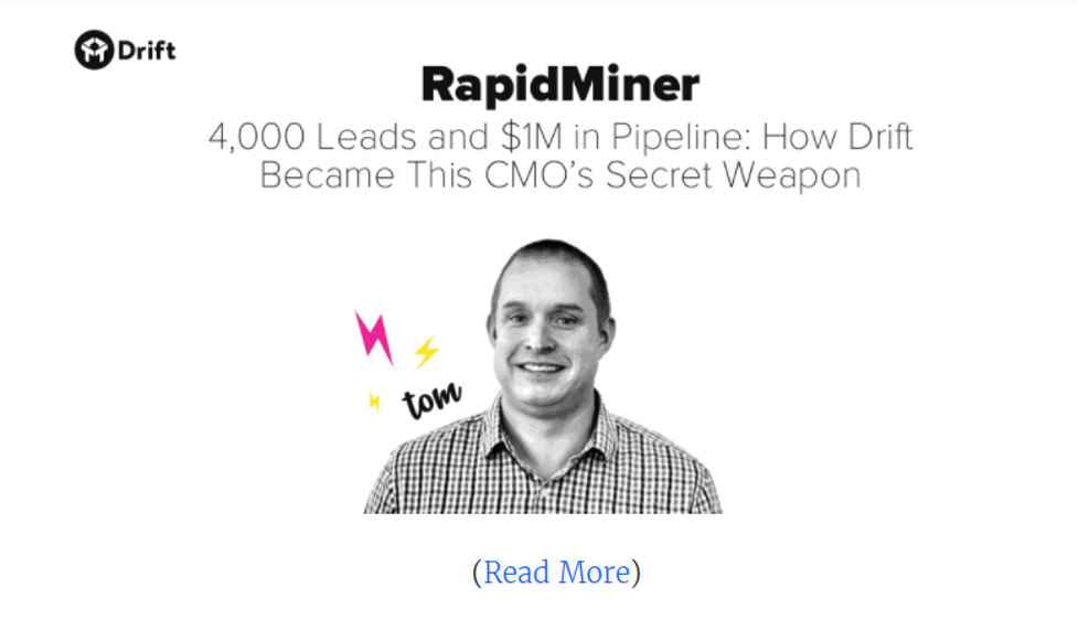
Featured customer testimonial on the Drift’s page.
This is the perfect way to introduce case studies into a landing page because:
It instantly tells you how a current customer has benefited from their product: 4000 leads and $1M in revenue.It shows that the case study is about a real company (RapidMiner) and features a real human from that company (Tom).It doesn’t overwhelm the page: if a potential customer wants to read more, they can. If they choose not to, the case study will remain hidden.You can follow these same rules as Drift to connect case studies to real-life humans, and also use it for social proof.
Another way to use social proof is to add Twitter, Instagram, and Facebook feeds to show how happy your customers are.
For example, adding Twitter cards to your landing page is a great way to show how much your customers love your product with minimal effort. Here’s how Airtable does it:
![7 Lead Generation Landing Page Examples [+ Optimization Tips]](https://internetmarketingworldwide.com/images/blog/thumbnails/202101/img_180112021814.jpg)
Airtable landing page featuring customer testimonials from Twitter. Source
The best part about these kinds of testimonials is that unlike blocks of text you add to your website, they’re impossible to fake. If a potential customer wants to double-check that the testimonial is legit, all they have to do is log on to Twitter ?
3. Optimize it to rank on Google
Even though landing pages are linked to marketing campaigns and product offers, they must be optimized to rank on search engines like Google.
There are lots of changes you can make to your landing pages to make sure Google is ranking them well, like:
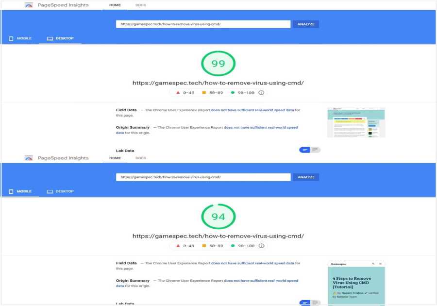
Writing short, keyword-optimized headings and titlesHaving a well-structured URLCreating clear meta descriptions that fit into Google’s search fieldsOptimizing your page’s loading speedLet’s take that second point — well-structured URLs.
Backlinko’s study of 11.8 million Google search results uncovered an interesting trend. Shorter URLs rank better than longer URLs:
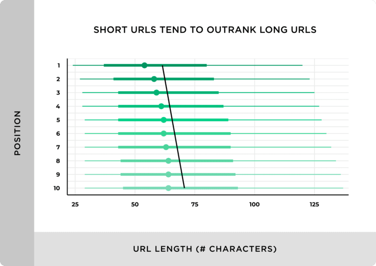
The study found the more concise your URL is, the easier it is for Google’s crawler to understand. You can take this information and use it to batch your landing pages together so Google knows where to find them. For example, your URL might be:
www.mycompany.com
And you’ve just created a lead magnet that shows potential customers ways to manage money. You can create a landing page with the URL:
www.mycompany.com/lead-generation/money-management
This creates a “nest” for your landing pages where text inside your landing pages and overall website are linked using subfolders. Simply put, this helps search engines like Google understand how your landing pages are stacked and organized, which makes them easier to find.
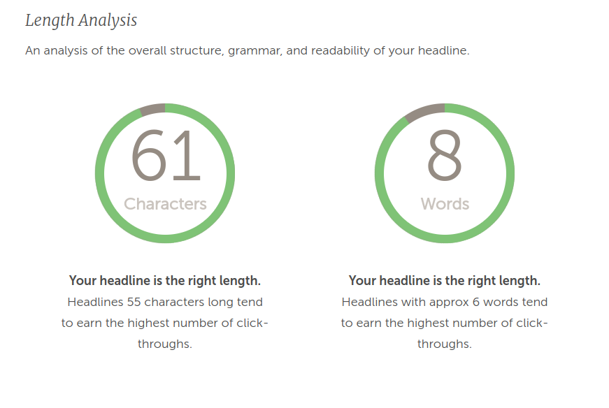
Using this same level of detail on your headlines and copy can bring in positive results on Google. For example, if you’re having trouble writing headlines or finding the right keywords, start using tools. CoSchedule’s headline analyzer can help guide you into what headlines will rank well on Google and how to improve them:
And Google’s keyword planner can help you uncover the right words to get your landing pages ranking.
![7 Lead Generation Landing Page Examples [+ Optimization Tips]](https://internetmarketingworldwide.com/images/blog/thumbnails/202101/img_180112021817.jpg)
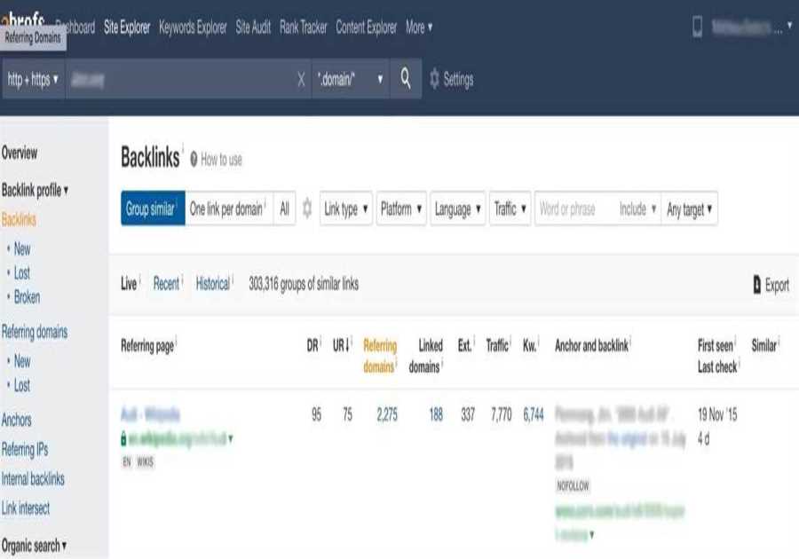
Pro-tip: If you’re unsure of how to use keyword planner to uncover the best keywords for your landing pages, check out Ahrefs’ epic actionable guide here
4. A/B Test your sign up forms
Arguably, the most important part of your landing page to get right is the sign-up form.
Like tip #2, the simpler your form is, the better. Cutting the number of fields in a form can boost the conversion rate, as the latest GetResponse data suggests. We found that landing pages with more input fields consistently see lower average signup rates:
Number of input fields in the landing page formAverage conversion rateTwo3.07%Three1.22%More than four1.16%GetResponse Email Marketing Benchmarks 2021The message is simple: if a form field isn’t necessary, ditch it. Ask yourself if you really need a lead’s phone number or address before you add it to a form.
However, A/B testing your landing page conversions goes beyond just tinkering with the number of form fields. Small tricks like removing navigation menus can boost conversions by 100%.
And then comes your call-to-action button and images.
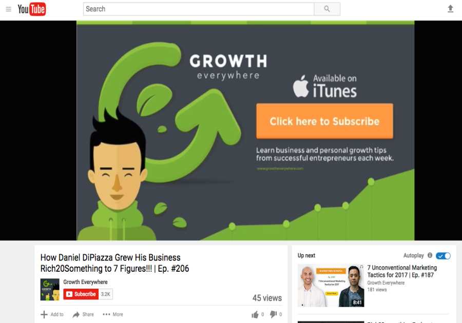
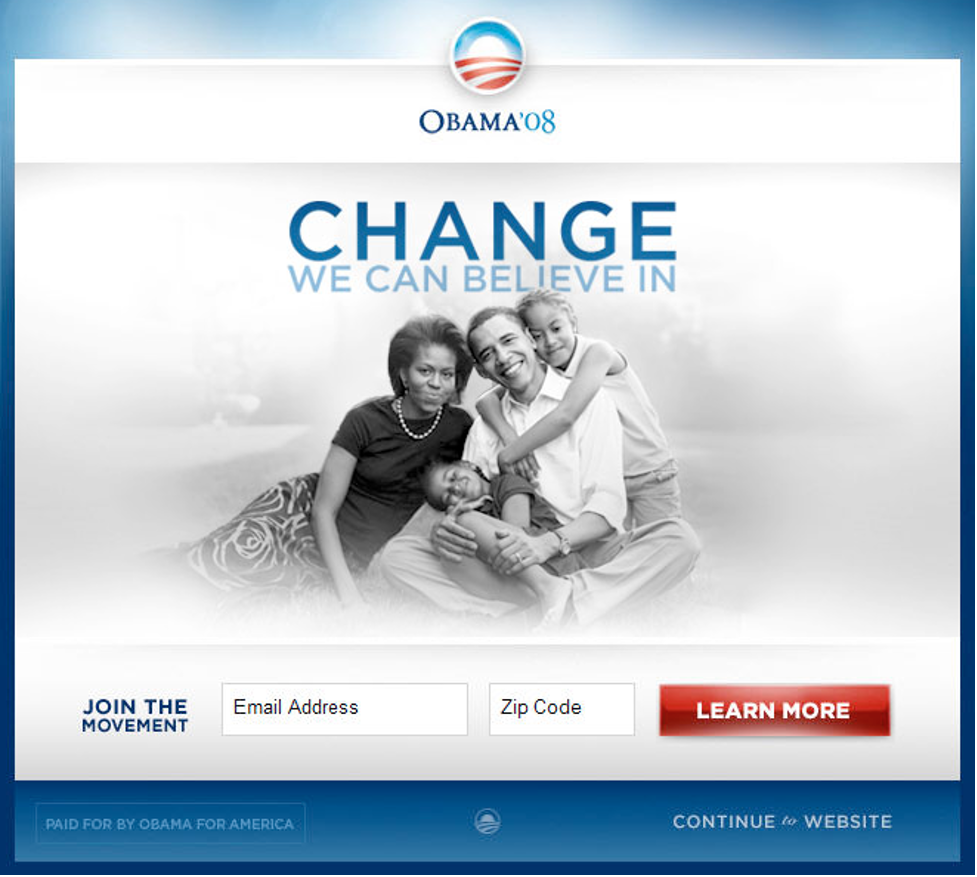
When former President Obama launched his campaign in 2007, hardly anyone knew who he was. His analytics team, headed up by director Dan Siroker, knew the key to funding the campaign was optimizing their landing page conversions.
Siroker said the campaign A/B tested early — and often. One of their first landing pages was this one:
![7 Lead Generation Landing Page Examples [+ Optimization Tips]](https://internetmarketingworldwide.com/images/blog/thumbnails/202101/img_180112021918.jpg)
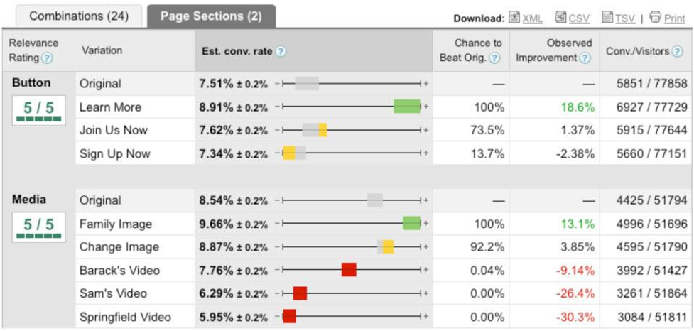
The team then A/B tested two elements of the page: the image, and the call-to-action button. The image varied from a family portrait to videos of Obama’s speeches. The campaign also tried different CTA buttons:


Through A/B testing, the team found a winning combo: a photo of Obama with his family with the “learn more” CTA.
Winning landing page variant for the Obama 08 campaign.
Siroker says before the campaign ran the experiment, a video labeled “sam’s video” was heavily favored by the team to use on the landing page.
“Had we not run this experiment, we would have very likely used that video on the splash page,” he says. “That would have been a huge mistake since it turns out that all of the videos did worse than all of the images.”
A breakdown of each A/B test the campaign ran
Overall, A/B testing boosted the campaign’s sign-up rate by 40.6%. Siroker says if the boost is taken into account and added to the campaign’s average donation amount, the small changes translated into an additional $60 million in donations ?
Now, I know you’re not running for president.
But the key takeaway from this example is that A/B testing copy and images can make a huge difference in your conversion numbers. By A/B testing and using the results to make some small changes, it could bring you thousands more in revenue!
Now—it’s your turn!
Perfecting your landing pages to increase lead generation doesn’t have to be rocket science.
In fact, with the right copy, a smart CTA, and a few tweaks in your testimonials, the change in your conversion rates can be huge.
The key to getting it right is to learn from companies who have already mastered their landing pages. Take note of what they’re doing right (and wrong) and use those lessons to perfect your own landing pages.
And remember, practice makes perfect. The secret sauce to optimizing your landing pages is A/B testing. Test, test, test until your landing page starts converting at a higher rate!
By: Michal LeszczynskiTitle: 7 Lead Generation Landing Page Examples [+ Optimization Tips]
Sourced From: Original Article Location: www.getresponse.com/blog/lead-generation-landing-pages
Published Date: date2021 01 15